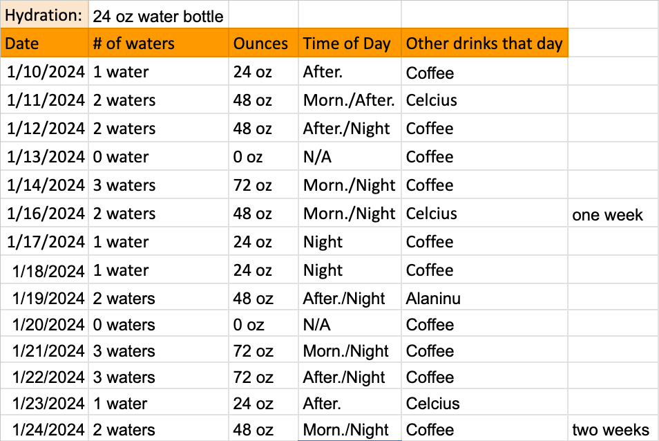
As I started this project, I was instructed to gather data over two weeks. During this time, I kept tabs on my daily exercise and water intake, suspecting a link between the two. I wanted to see if staying hydrated had an impact on my exercise performance. Below, I created a Google sheets with detailed information about my day.
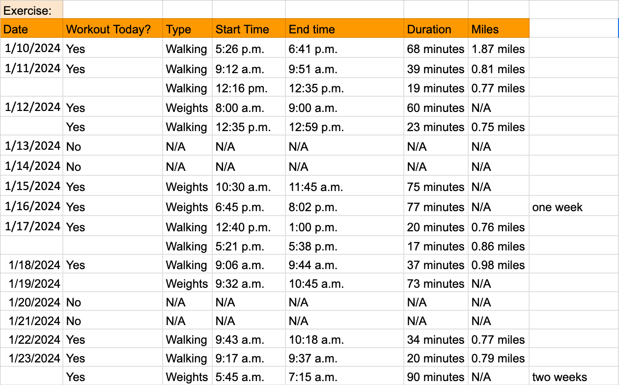
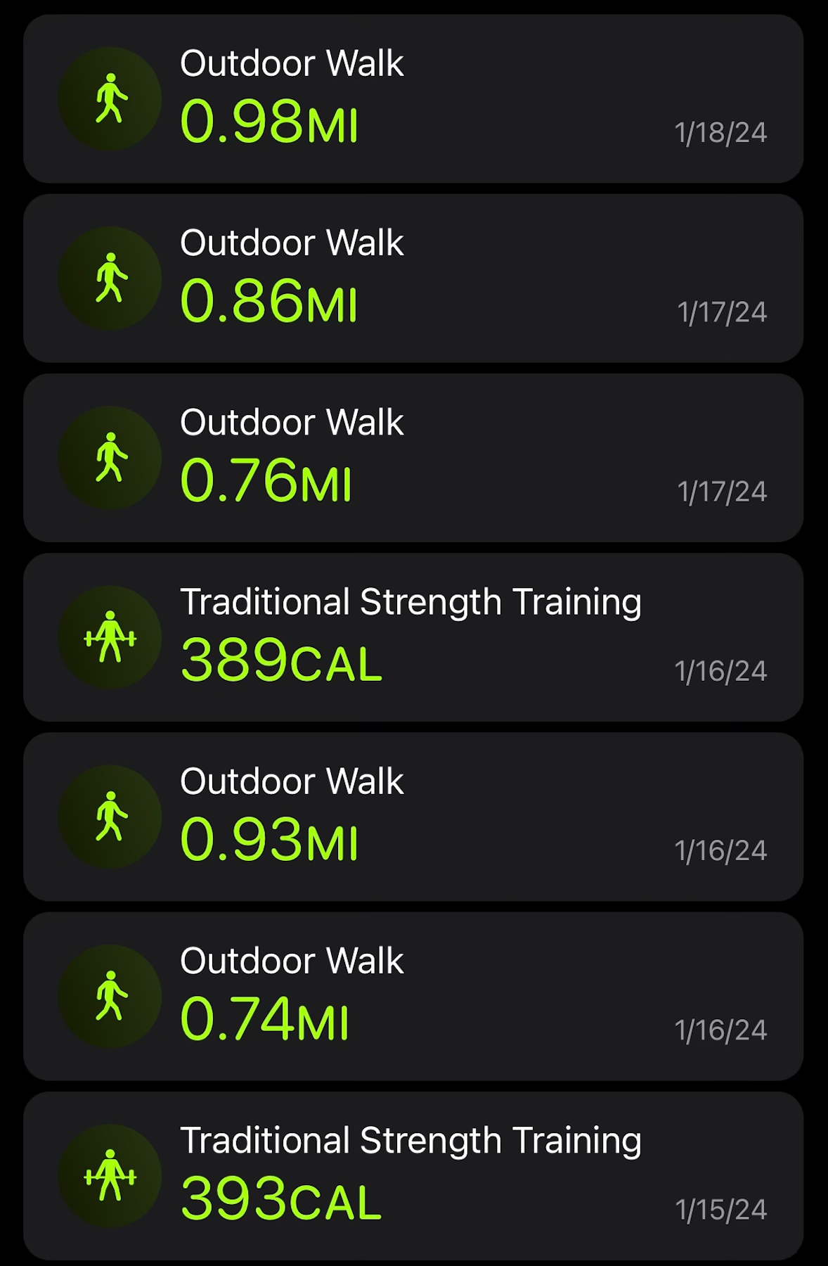
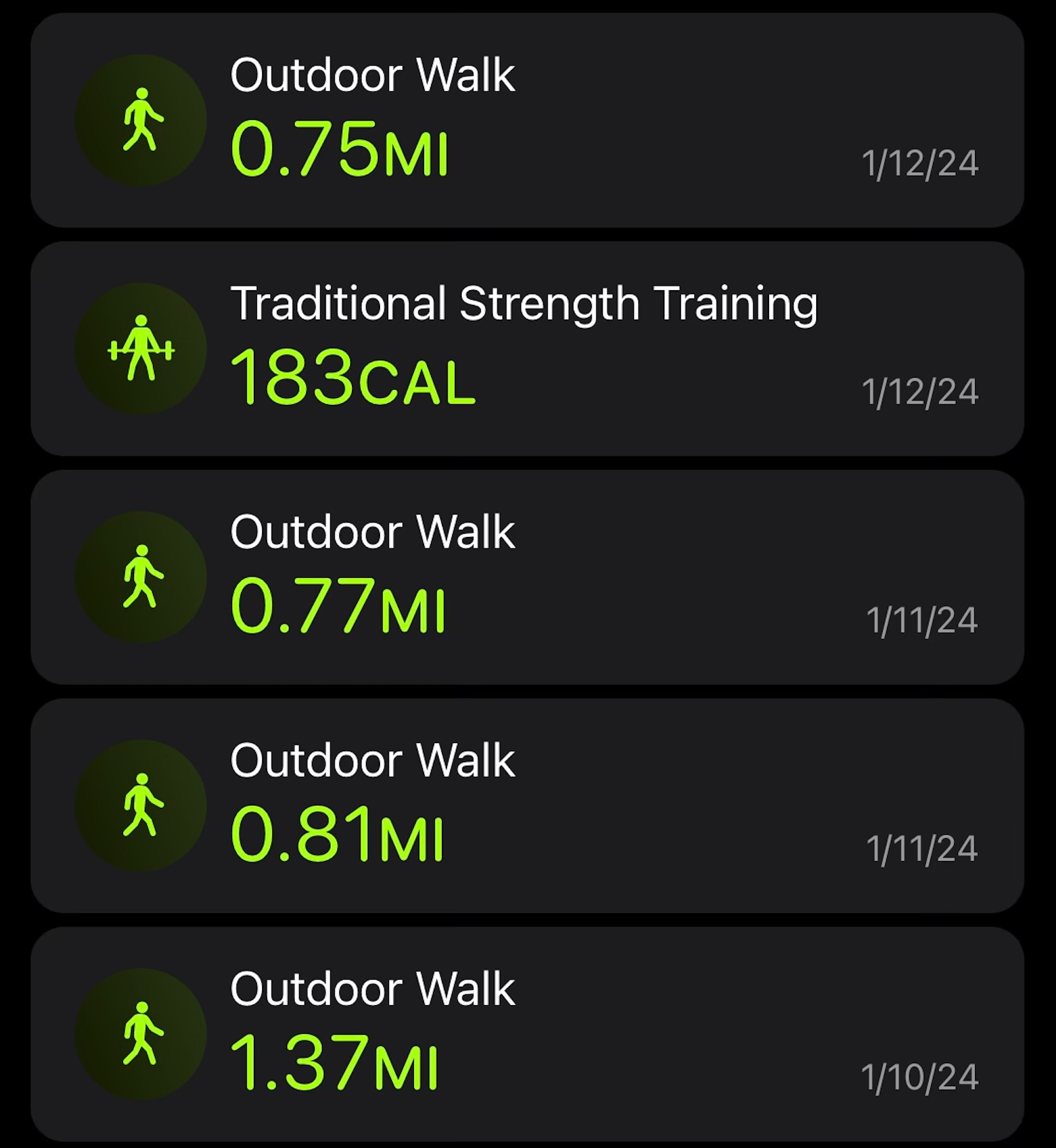
However, I wouldn't have been able to collect the data about my exercise without the Apple Fitness application that was linked to my Apple watch. On this app, I was able to track the miles I walked, calories burned, and time tracked.

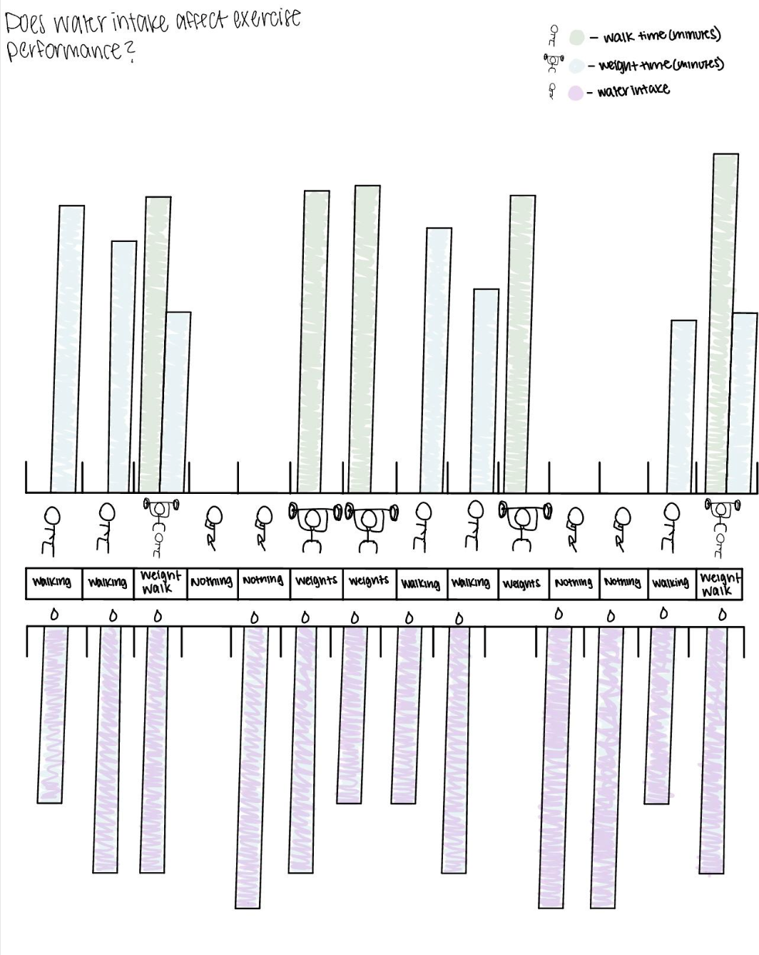
With my data collected, I began to ideate through sketches different graph options to place my information into. During this process, I had difficulty finding a graph that could hold my information correctly, but I decided to go further on the first graph idea.

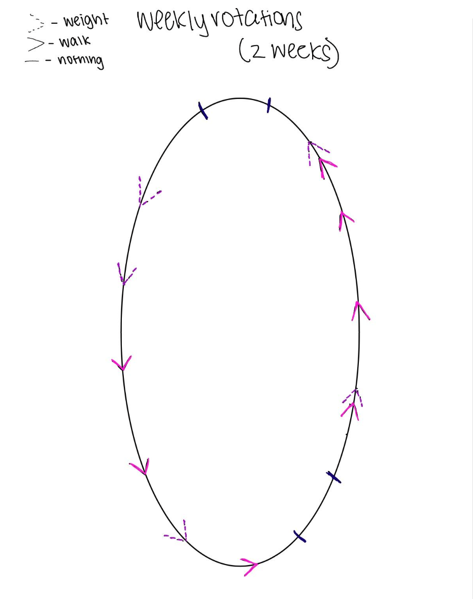
As I dug into my research further, I decided to shake things up with my initial concept. I transformed it from something simple and structured to something more dynamic and unique. The new graph now resembles a track sliced in half. This change allowed me to add more details on each side. I also switched the track's orientation from vertical to horizontal and added a 45-degree split to keep its 'track-like' vibe intact. Still having to improve the graph on the right, I aimed to create a more organized poster.
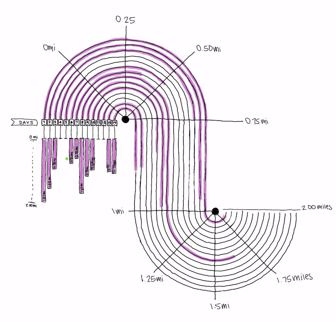

Below is my final graph poster concept: Tracking Miles and Hydration.
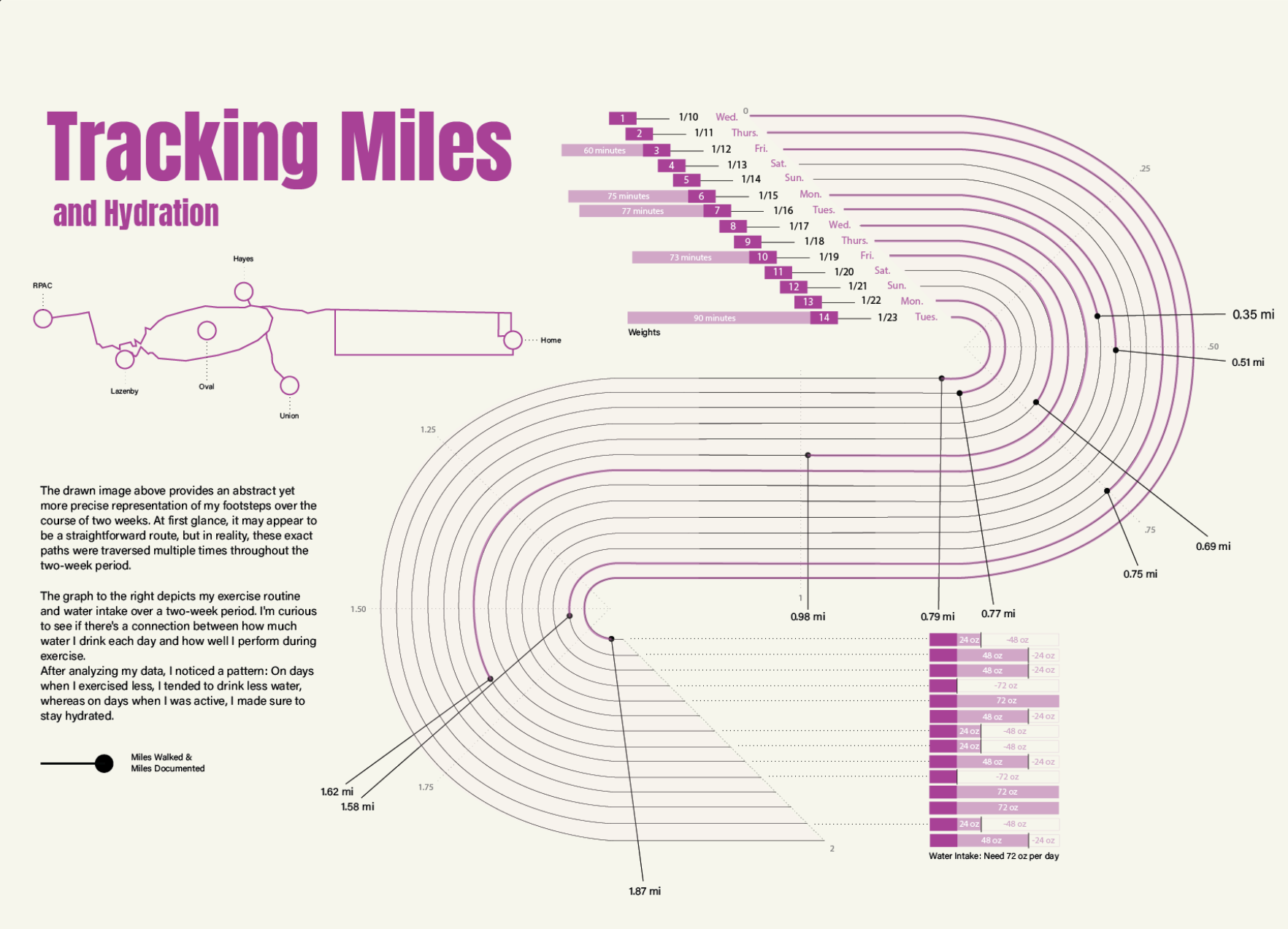
To enhance readability, I adjusted the alignment and font size of the information on the left side of the page, aiming to direct the viewers' attention toward the explanatory body text and the map of the abstractly drawn steps below the title. As you shift your gaze to the graph on the right, you'll notice the precise starting date of the data. The primary track illustrates a two-mile span, marked with indicators denoting specific distances. Additionally, labeled bar graphs are positioned from start to finish, aiding in interpreting the provided information on weights and hydration.
Throughout this project, I encountered numerous challenges, many of which were entirely new to me. As it was my first venture into fully designing a data visualization graphic, I initially limited myself to simpler graph types like pie, bar, line, and plot graphs. However, I tackled this limitation head-on by immersing myself in lectures and conducting research to learn new graphing techniques.
This process not only expanded my technical skills within Illustrator but also gave me confidence in my ability to create graphs independently. In previous years, I relied on placing data into chart templates, but by tapping into my creativity, I was able to craft visually appealing and unique designs.
If given the chance to keep improving, I see myself expanding this project by creating similar graphs that dive more into weight and hydration, doing a similar approach, like the one taken with the track and distance correlation. In hindsight, I recognize the value of gathering more data on my hydration and weightlifting routines, which would have undoubtedly helped the development of these extra graphs.